(Originally posted on GamesIndustry.biz for their Why I Love series)
I will never again make a game with characters who have knees.
Looking at modern video games, there is a mind-boggling amount of time spent making 3D characters feel cohesive with the worlds they inhabit to avoid breaking immersion. Inverse kinematics, animation lerping, idle fidgets, facial expressions…there’s a whole host of little details to nail, and nothing shatters verisimilitude like the player character’s cool dress clipping through her giant sword.
But folks, that’s all very hard. Even after animating an entire game, the most basic rigging and IK tasks still prove esoteric and frustrating. I targeted an N64-era aesthetic in hopes of reducing my workload for these technical tasks, but I overlooked a critical characteristic of early 3D games: Expectations and hardware were different in the ‘90s, so even when animation and rendering details were visible at 240p on a CRT TV, they would go unnoticed by most players. Consequently, their developers necessarily opted to cast aside unnecessary details in favor of tightening their aesthetics.
I don’t think I’m injecting too much intentionality through hindsight here. Sure, perhaps character animations needed to be exaggerated just to be understandable at low resolution, but that also made them more expressive. Yes, objects needed bright colors and clear silhouettes so they didn’t all blur together, but that’s just good visual design.

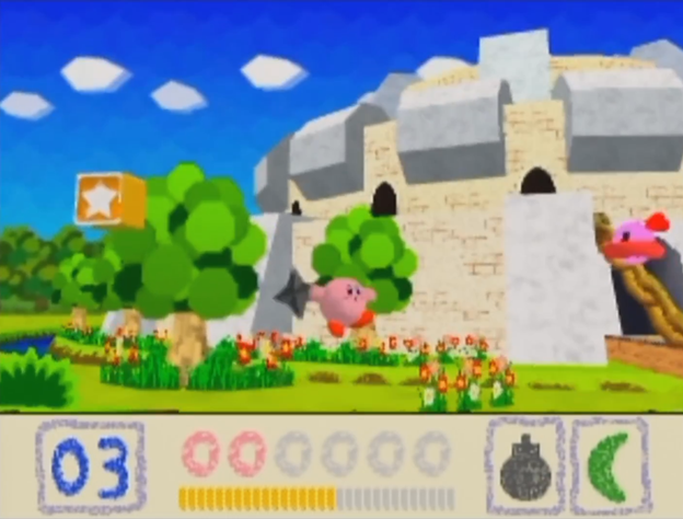
Fittingly, Kirby 64 is still one of the best-looking games out there. The use of colorful backdrops populated by abstract shapes and patterns reflects the playful nature of the franchise, while also cleanly evoking a sense of each location without getting bogged down in the details of actually rendering it accurately. Enemies are often little more than colored 3D shapes, carefully selected and dramatically animated for an intuitive a sense of how they move and what powers Kirby might absorb from them. Kirby and his friends never speak (aside from Kirby’s adorable cries when injured or excited), yet the game’s wordless cutscenes effortlessly convey the whimsical drama driving them forward.
The level of visual abstraction is sublimely balanced; details that matter most are given color and emotion while superfluous details are discarded. Reflecting on it recently, it bears some interesting similarities to Impressionist art.
The Impressionist movement in art was one of deprioritizing detail in favor of overall feel or flow, less about capturing verbatim a scene or a moment and more about reflecting its essence, its impression. A tree need not be painted to look visually realistic when the artist can skillfully compose a deeper, abstractly realistic portrayal of a tree, evoking what a tree truly is beyond its mere appearance.

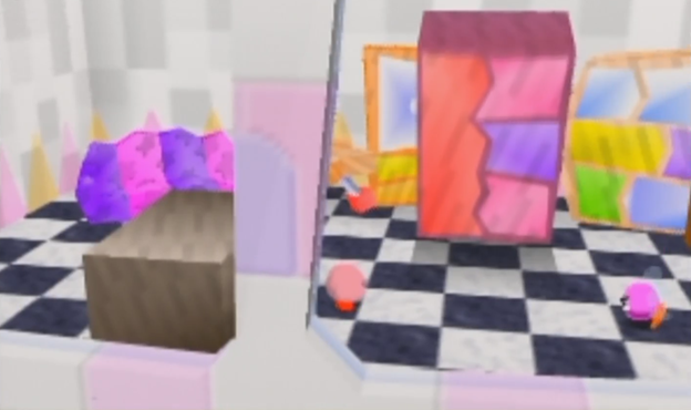
Similarly, Kirby 64 often elaborates on plain setpieces with abstraction. The clean grassy fields of Kirby’s home planet are littered with checkerboard boxes and green pyramids, not to depict literal objects but to simply evoke the sense of the planet itself. Later, there’s a delightful mall-like level consisting of vignette rooms, each of which clearly reflects a specific scene – a furniture shop, an electronics store, a storage room – using only what explicit features are necessary, with haphazard shapes filling in the rest.
Additionally, Impressionist paintings highlight their own artificiality; look closely and the individual brush strokes are laid bare, the hand of the artist manifested in the work. Impressionist paintings are in part a celebration of themselves, revelry in the craft and techniques that produced them.
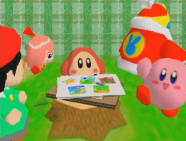
Kirby 64 is no different in this regard. Kirby bounds and bounces past enemies who stretch and skew alongside him, with exaggerated animations that make clear the computation driving them but also express energy and joy with even simple movements. His attacks are huge and evocative, with flaming phoenixes and electrified boulders that clip through objects without a care. And, how does Kirby enter each stage? He and his friends huddle together in a plaid void, with a simple prop or two to evoke the theme of the world, and the sense of joy and adventure is palpable as he runs off-screen with a wave and a cheery “bye!”

Details are omitted or ignored because they don’t matter, and what remains is engineered to reflect an emotion, an essence. Kirby 64 is simply a cute, cheery game, and it is also a simply cute, simply cheery, simply gamey game. At every step, it is a distillation of the inherent joy of playing a game and having a good time, making every oversight, hardware limitation, or technical hiccup melt away.
I mean, can you even imagine Kirby with knees?